Camilla Maia Senior Product Designer — Münster, DE

Specialist in complex B2B SaaS and developer-adjacent products. Design that moves metrics.

Retrospective
Prep Flow

Year · 2022

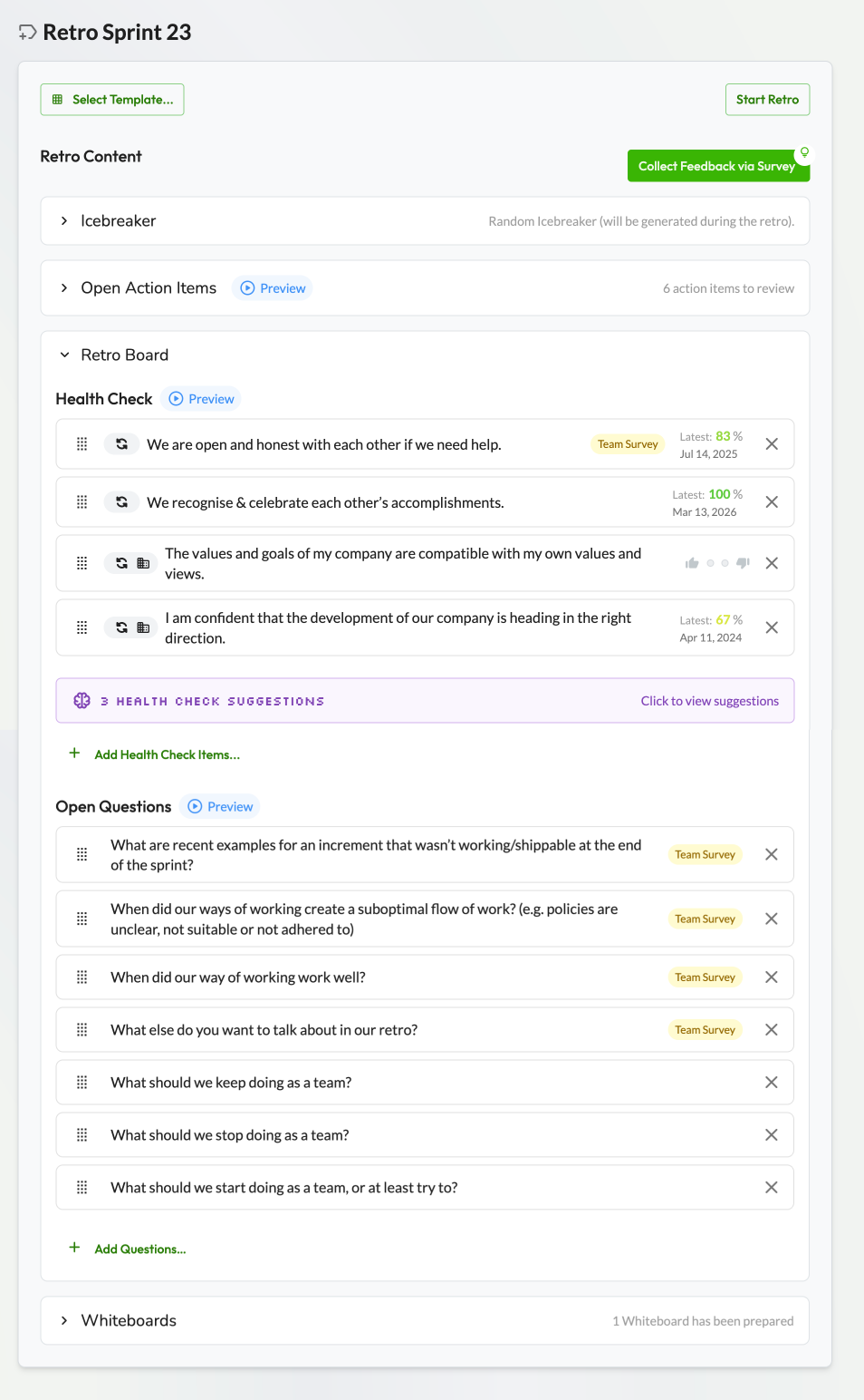
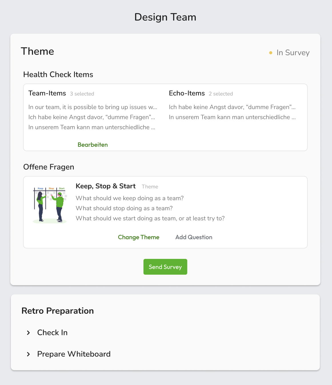
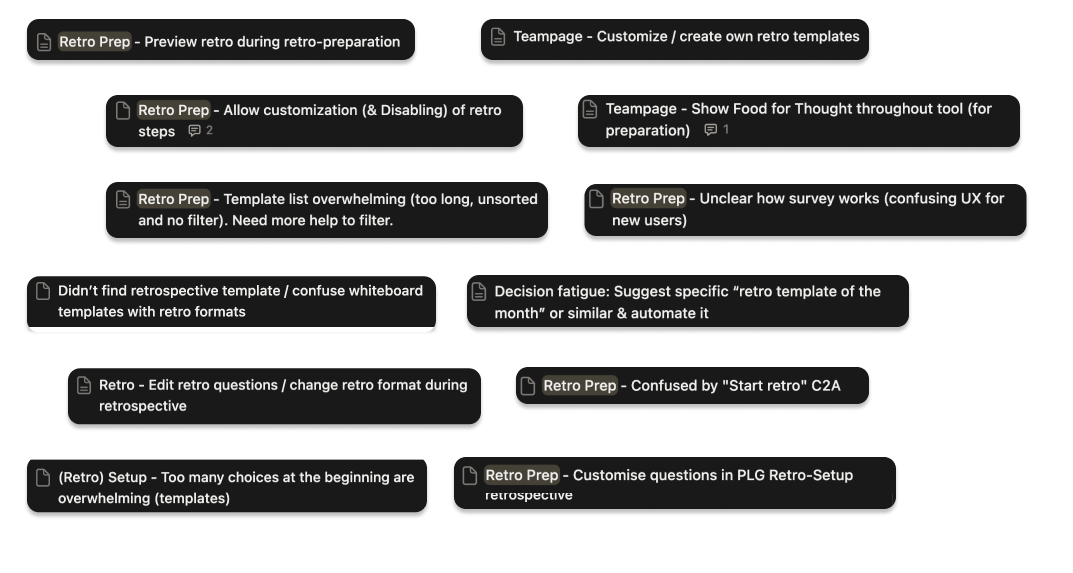
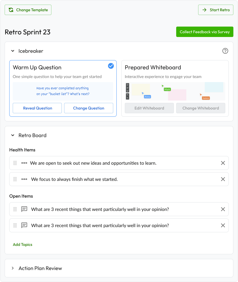
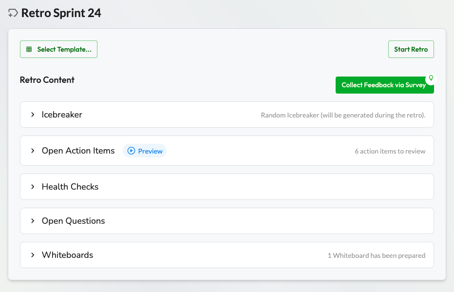
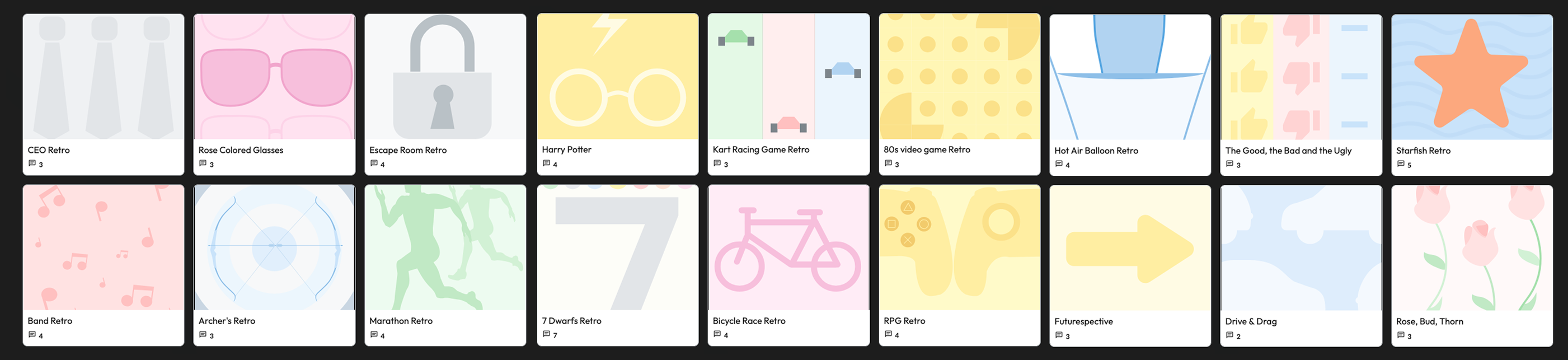
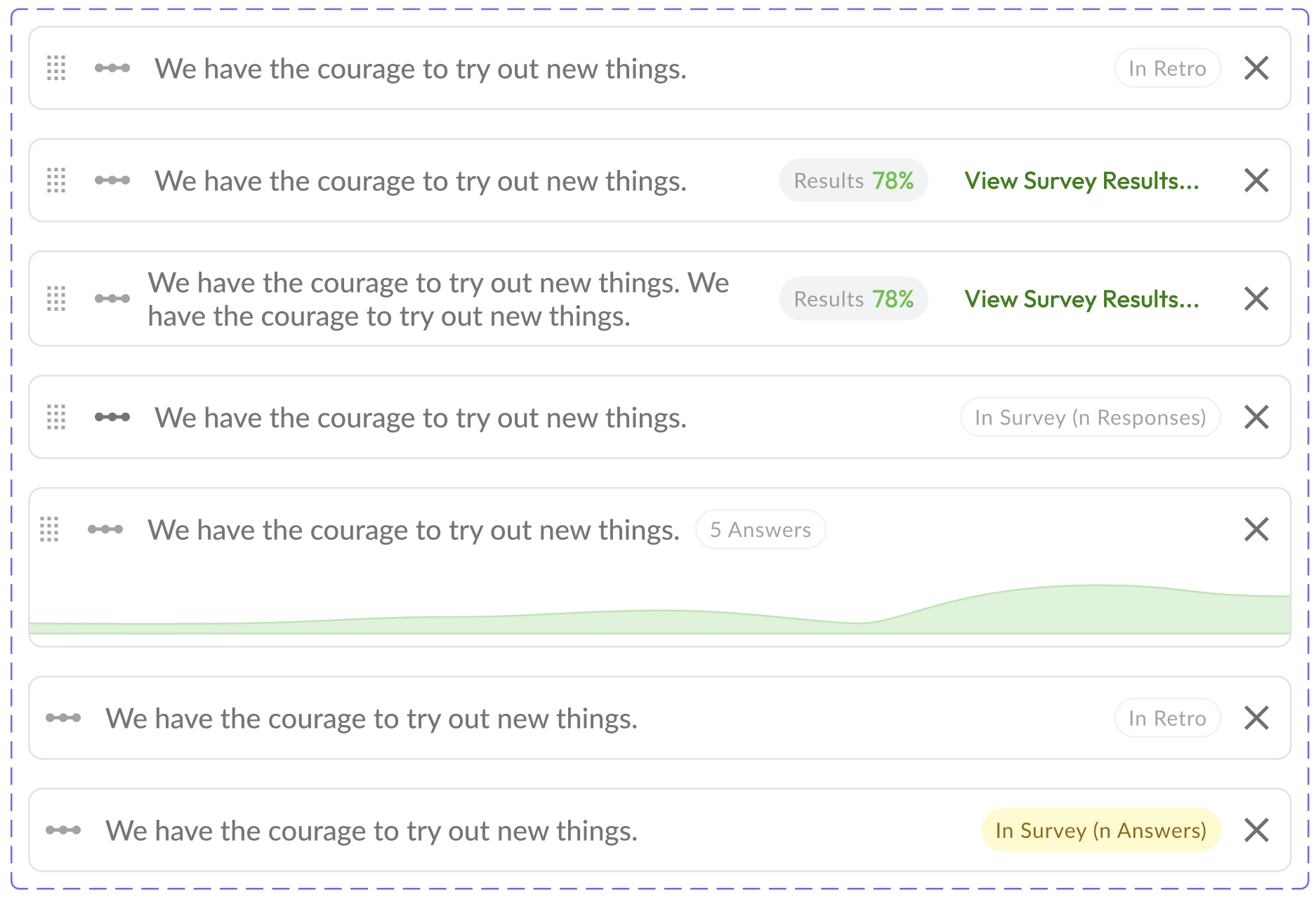
Users weren't converting to their first retrospective. Support tickets and user interviews pointed to the same problem: the preparation flow was cognitively overwhelming and structurally unclear.

I identified cognitive overload as the primary hypothesis. What made this project interesting was what we chose not to fix — and why that was the right call.

Company
Echometer
Year
2022
Methods
User interviews, usability testing, support ticket analysis
Team
4 — PM, Designer, 2 Engineers
Constraints
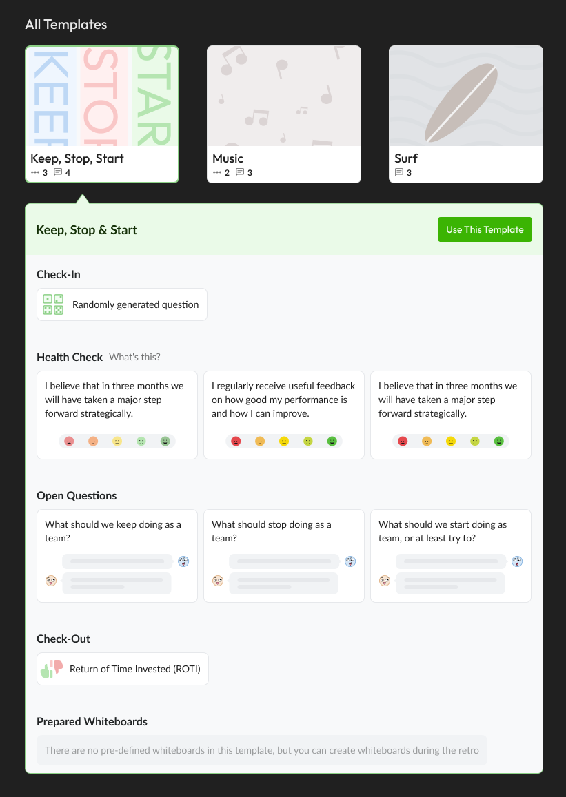
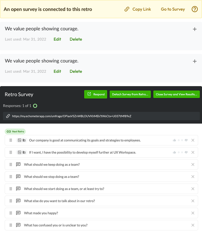
Item picker was deferred — item rotation logic, whiteboard wiring, and survey lock-in after sending made it too complex to fix in scope. Shipped a validated partial fix instead.
Role
Strategy Design Implementation Validation
Credits
Strategy, UX/ UI Design, Prototyping. Camilla Maia
Strategy, Scoping. Jean Michel
Strategy, Implementation, Review. Robin Roschlau
Implementation. Johannes Niermman
Retro preparation

The flow confused users before the retro even started.

I diagnosed the root cause as cognitive overload — the flow asked users to make abstract decisions with no mental model of what they were preparing for.

Retro preparation
Retro preparation

The retro structure existed in three places. None of them matched.

The core problem wasn't just the prep flow in isolation — it was that Echometer's retro structure appeared in three different contexts across the product, with no visual or structural consistency between them. Making them consistent was the real fix.

PLG onboarding

Users encountered the retro structure for the first time during signup — but it looked and felt completely different from the tool itself.

Retro preparation

The prep flow presented steps in a different order and with different framing than the actual retro — creating a mental model mismatch before users even started.

Running retro

The in-session experience had its own visual logic. Users who completed prep arrived to a different-looking product than what they'd just prepared for.

Retro templates Retro preparation checkin Retro preparation survey

Mirror the prep experience to the retro itself.

The core insight was that users had no mental model of what a retrospective would look like — so the prep felt abstract and unmotivating. The fix was to make the prep visually mirror what they'd see during the actual retro.

I merged steps, simplified the survey presentation, and reframed each step around the outcome it produced — not the action it required.

Rather than a traditional design handoff, I worked directly alongside the engineer during implementation — reviewing and iterating on UX and visual decisions in real time. This reduced back-and-forth and kept the final product close to the intended experience.

Retro old start Retro new start
Retro new start

Part of the problem was out of scope. I shipped anyway.

The item selection model was also contributing to confusion — but changing it would have added significant scope and delayed the fix to the core flow. I identified this boundary early and proactively recommended deferring it to the founders.

The founders aligned quickly — the priority was staying lean and shipping fast. We shipped the validated solution without the full fix.

The deferred problem was documented, quantified, and advocated for in the next roadmap cycle. It eventually got built — which validated the original judgment call.

Contributing to the long maintenance of our systems

The item selection model was also contributing to confusion — but changing it would have added significant scope and delayed the fix to the core flow. I identified this boundary early and proactively recommended deferring it to the founders.

Components

The care for accessibility was a primary concern

Keyboard navigation was a primary concern. The redesigned sidebar introduced multiple accordions and nested sublevels — a structure that creates non-trivial tab order complexity. Each state (collapsed, expanded, active) was reviewed for focus management, escape key behavior, and ARIA labeling. A user navigating by keyboard needed to experience the same hierarchy as one using a mouse.

Conversion moved. Even without the full fix.

M1 activation (first retro completed) was the target metric. We shipped with a clear hypothesis and validated it through qualitative signal — the survey adoption number confirmed the direction.

3% → 15%
Retro survey adoption

The retro survey — a core feature of the user happy path — went from negligible usage (~3%) to 10–15% of all retros prepared weekly. The most direct signal that users were now engaging with the full retro structure.

29% → 38%
M1 activation — A/B, n=571 workspaces

First retro completion rate moved from 29.3% (control) to 37.8% (show) — a +29% relative improvement. Measured via PostHog funnel across 571 workspaces.

Defer → Ship
Deferred scope — eventually shipped

The item selection model I flagged and deferred was eventually built in a later roadmap cycle — validating the original scope recommendation.

Next Case Study

Signup & Activation