Retro Component
Architecture
2026
Specialist in complex B2B SaaS and developer-adjacent products. Design that moves metrics.
Inconsistent UI is usually a symptom. The actual problem lives a layer deeper — in the decisions, or lack of them, that shaped the codebase. I tend to look there first.
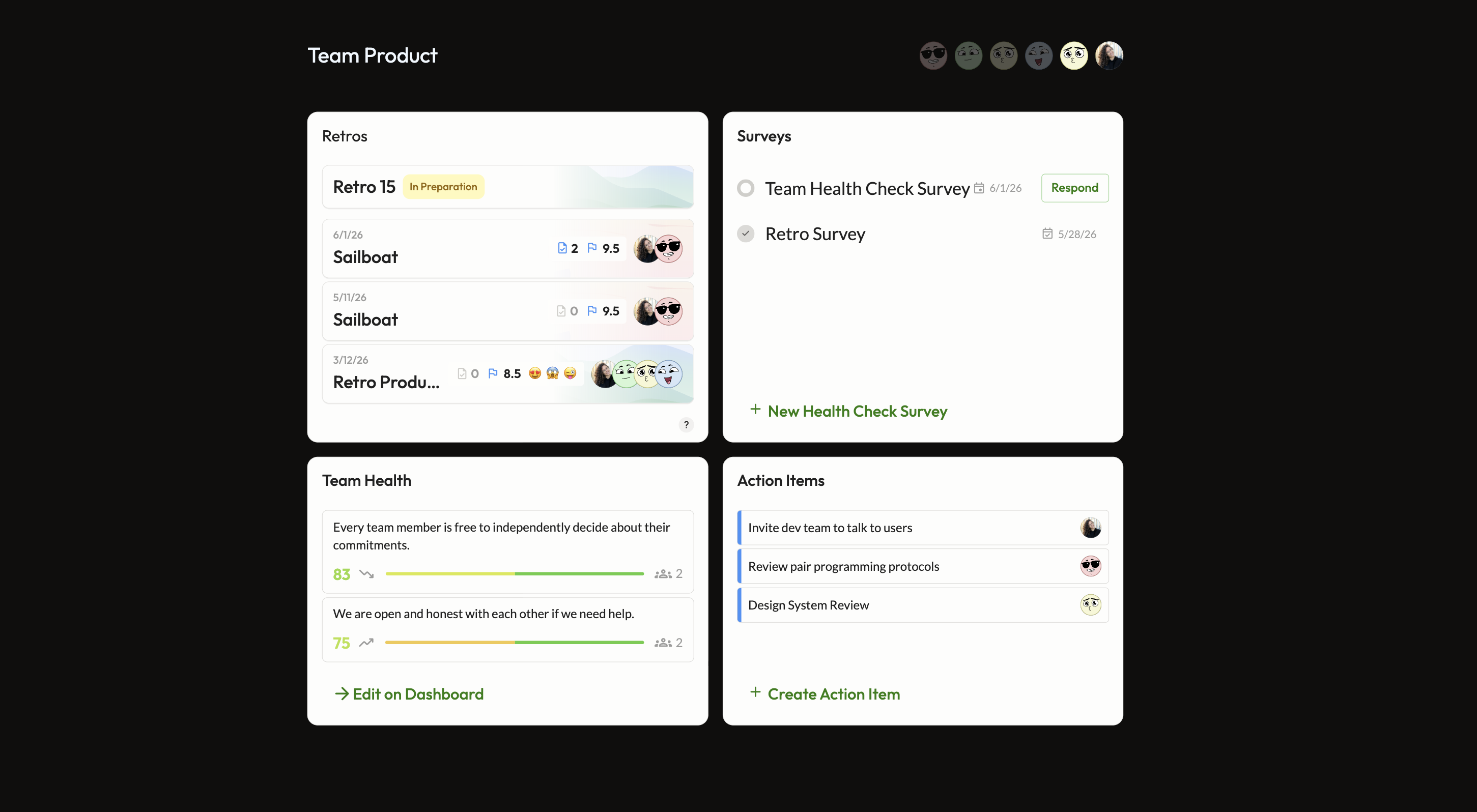
At Echometer, the retro feature appeared across six product surfaces. Visually, they felt like different products. When I traced why, the answer wasn't styling — it was that most of these surfaces had no shared component at all. Some had their own. Others were held together with one-off inline code. There was no foundation to be consistent from.
So I built one. A single context-aware component covering all six surfaces — designed, implemented in HTML, Tailwind and Angular, and shipped into the live design system end to end.
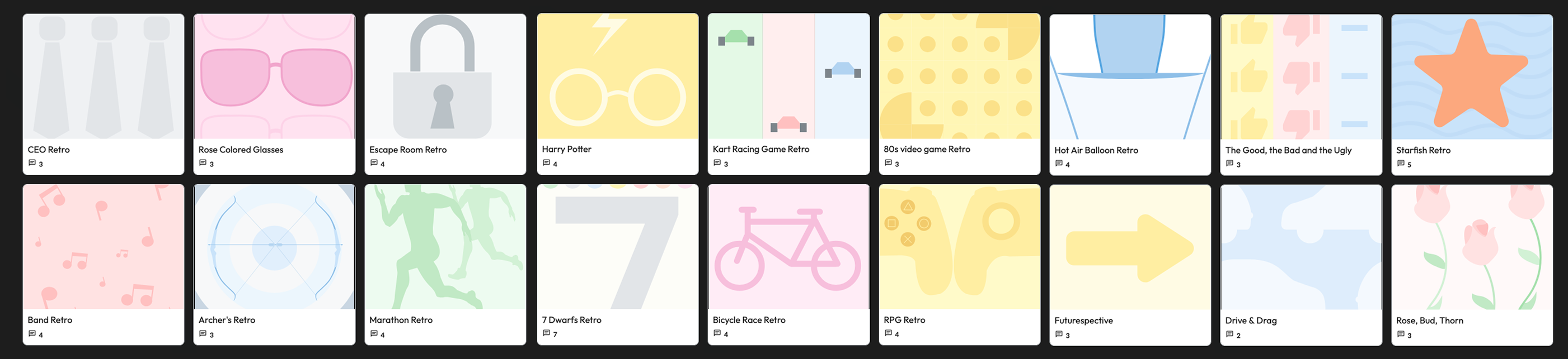
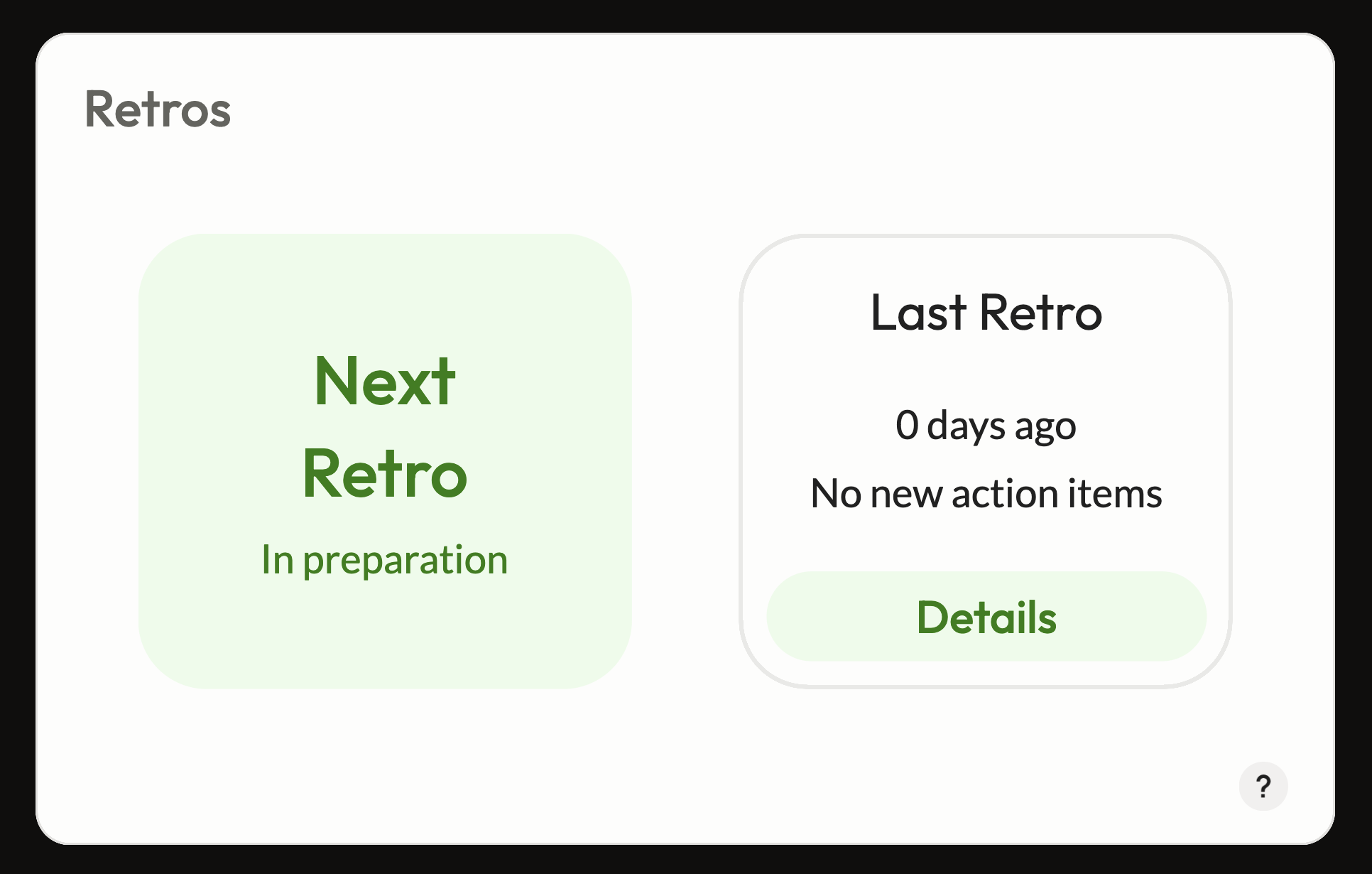
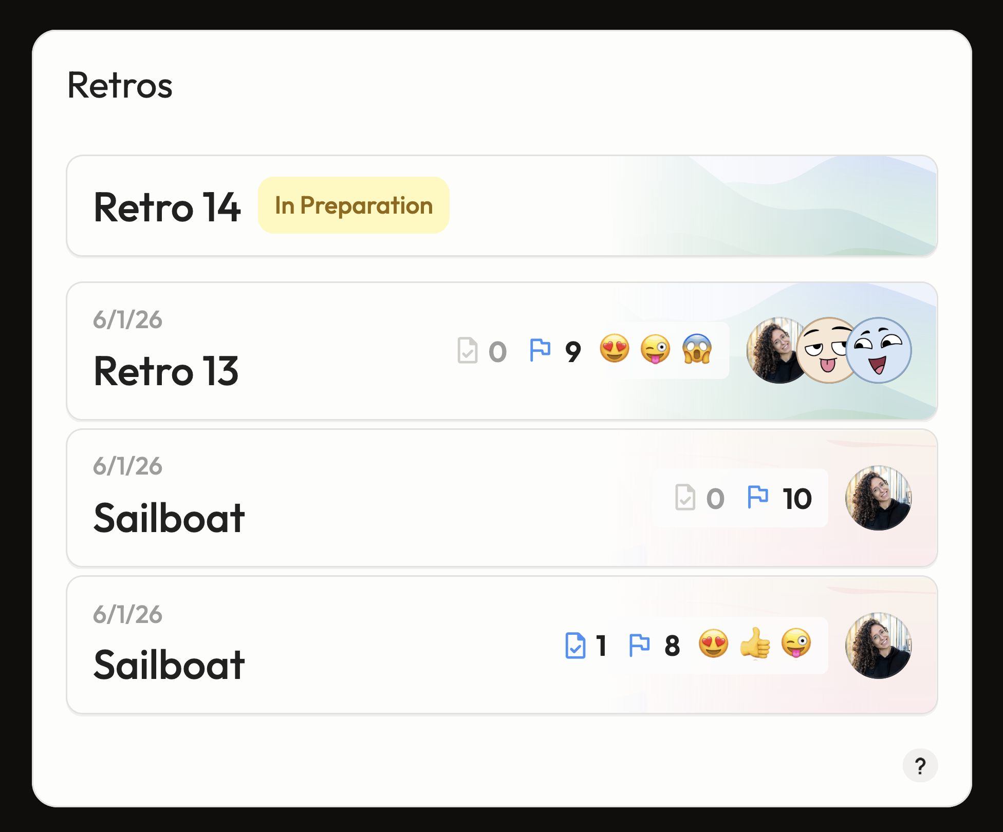
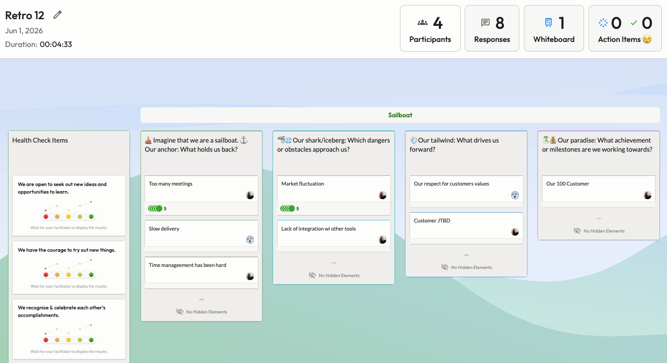
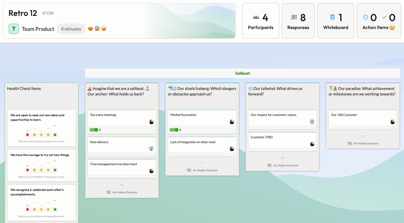
Every retro already uses a template. For those that don't, they are assigned the standard background image. The template images are a strong, already existing and widely recognizable element of the retros.
The visual inconsistency was obvious. But user workshops made clear it wasn't just an aesthetic issue — users couldn't orient themselves across retro states. That friction was a direct consequence of how the UI was built: most surfaces had no shared component at all.
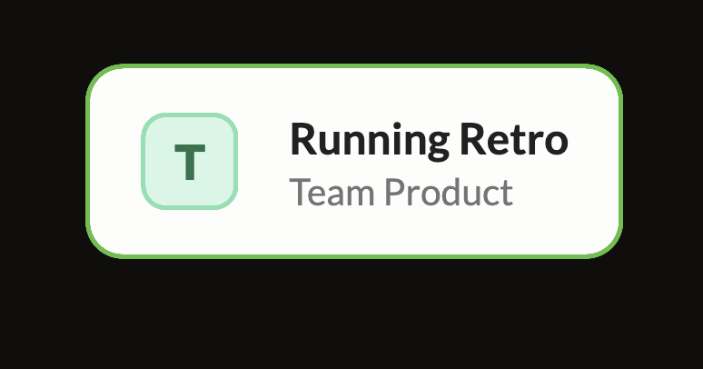
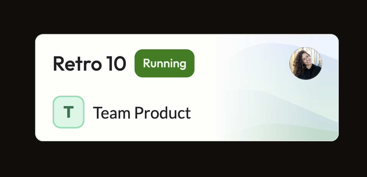
Context props control what's shown — layout, data density, actions — without branching into separate implementations. The same card shape and interaction pattern, from the lightest surface to the densest.
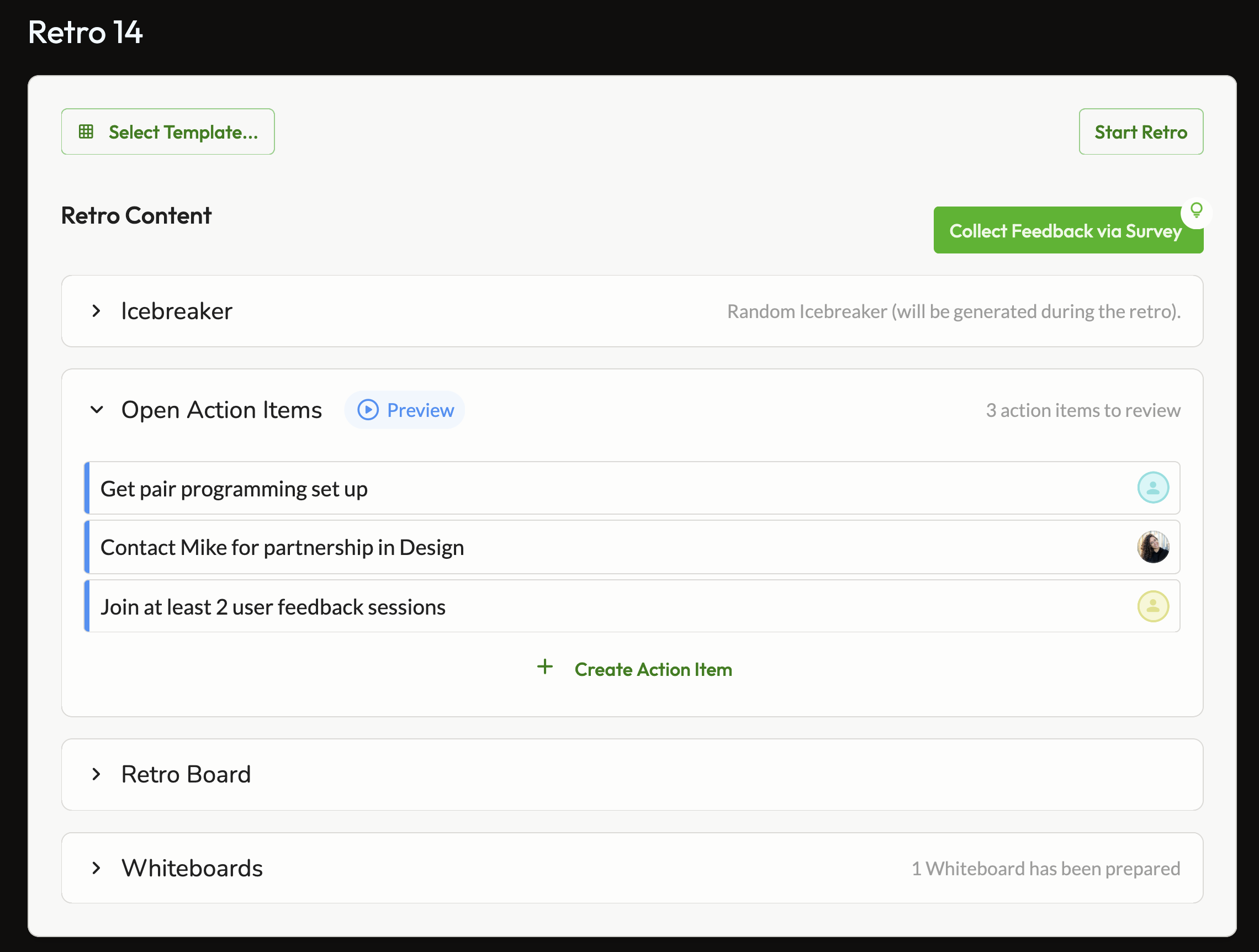
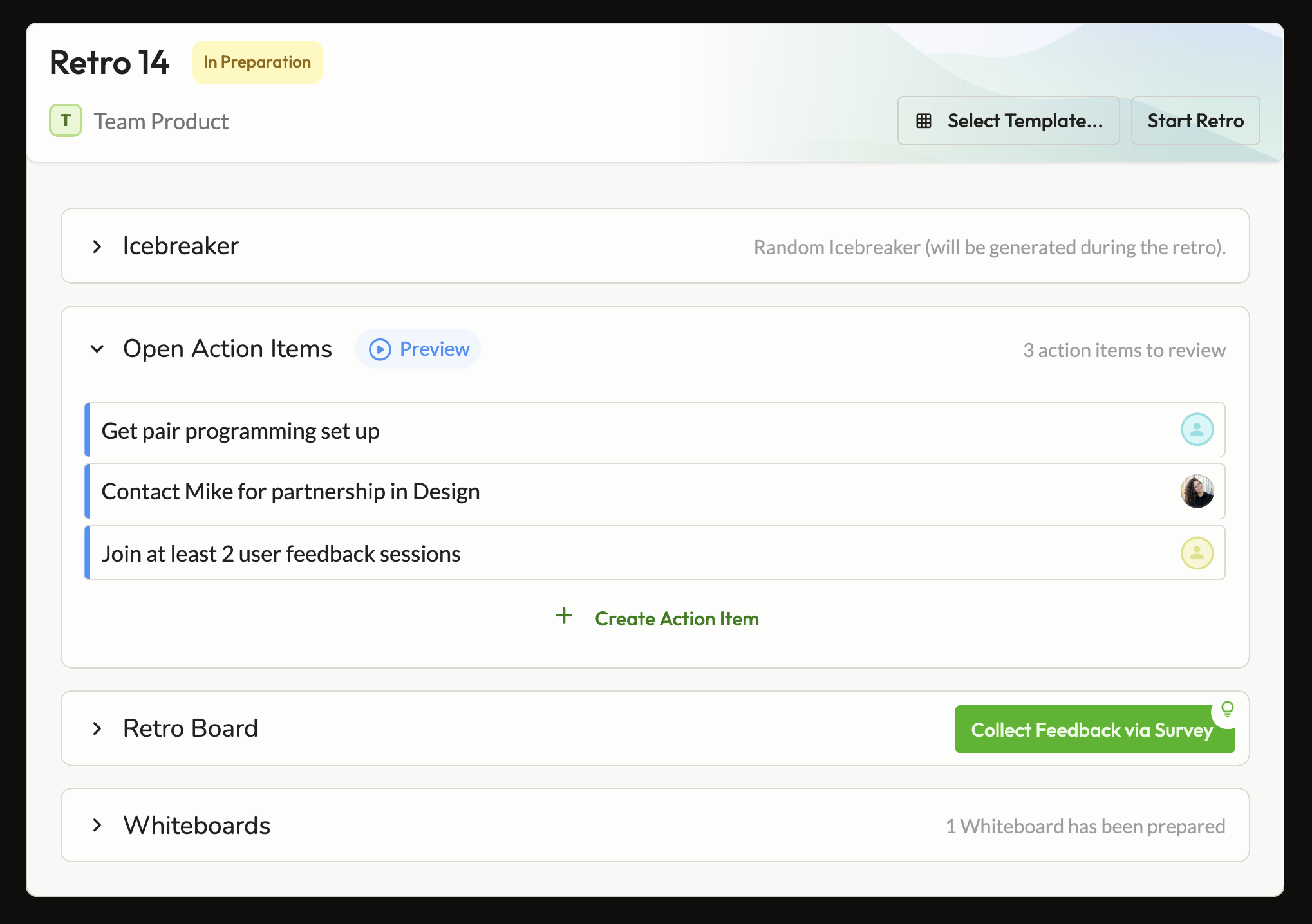
A single Angular component with context props — not six separate components — so users always encounter the same visual language regardless of where in the retro lifecycle they are. The main challenge was handling the range between very light contexts (a title and one action) and data-heavy ones (participant lists, session metadata, navigation) within the same template without it feeling stretched or cluttered at either end.
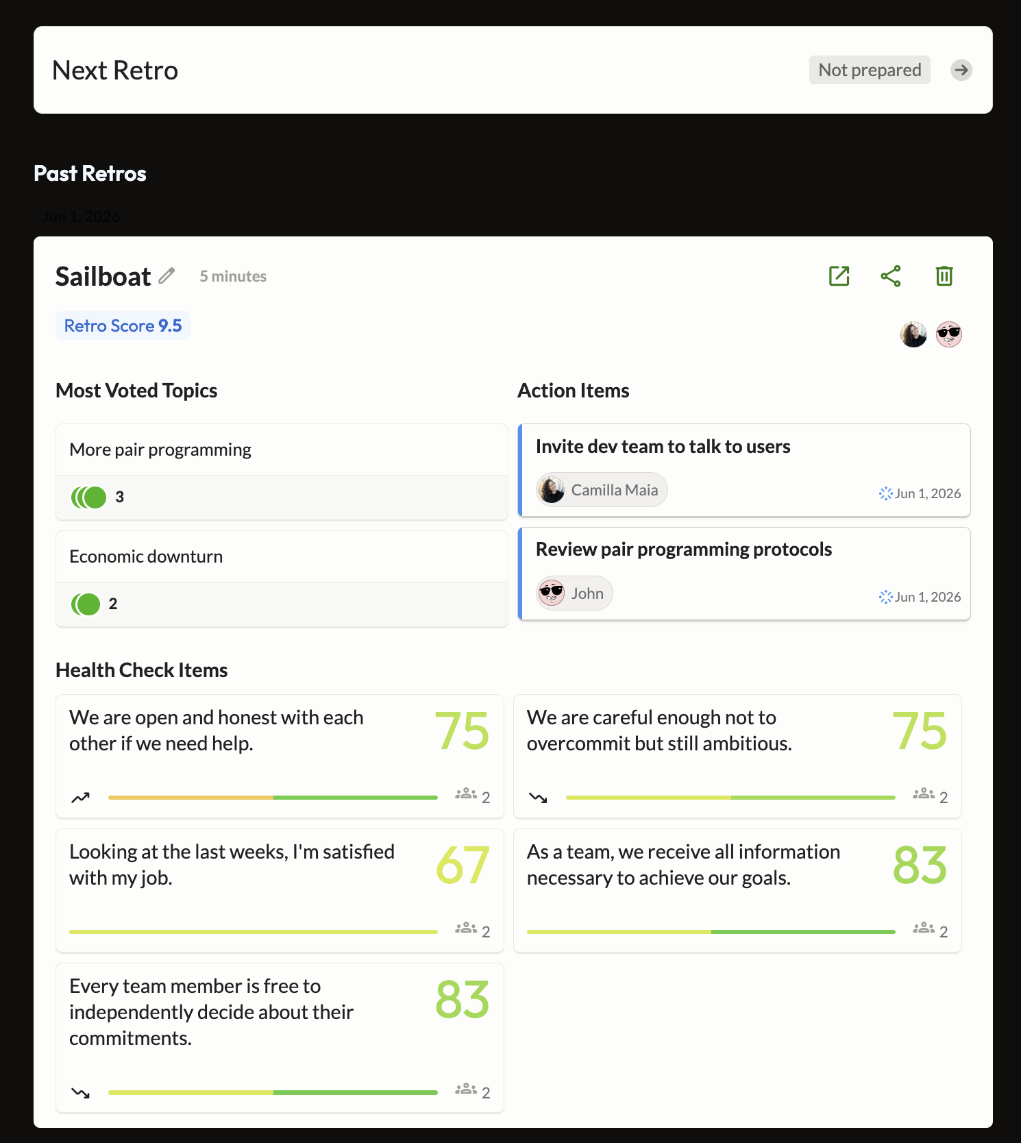
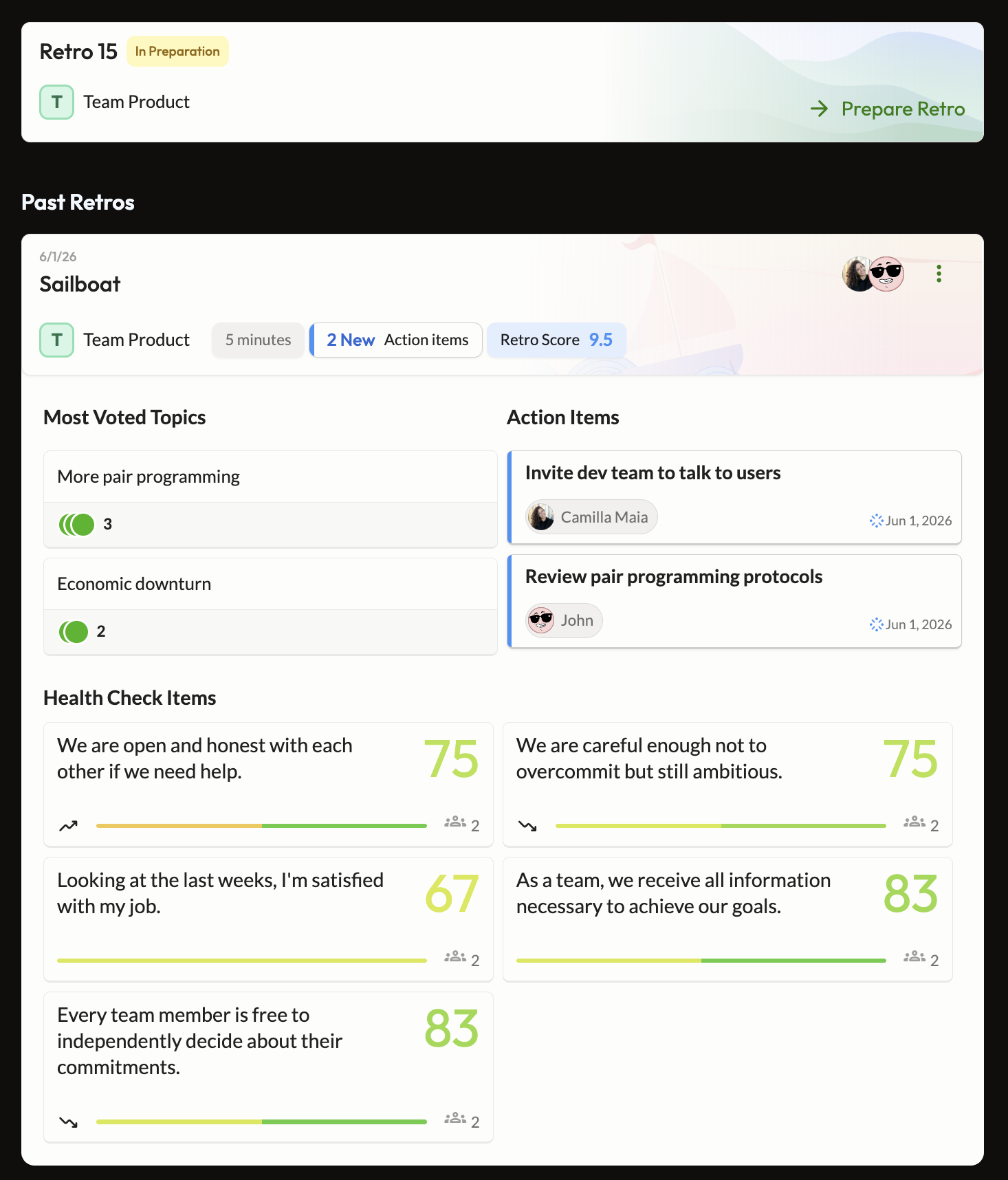
Figma specs covering all six context variants, and the Angular component file as the live implementation. Both live in the design system — the next person building a retro surface has a working reference in design and in code, not just documentation.
A/B hypothesis: a structurally consistent retro UI — with clear lifecycle state signalling across all surfaces — increases retro session conversion rate. A meaningful result would be a measurable lift in the share of teams who run a retro after entering the retro flow.
From a minimal quick-entry card to a full historical archive — all driven by the same component, the same tokens, the same interaction logic.
Large parts of the retro UI had no shared component — just inline one-off code. This project introduced a single reusable foundation for the first time.
The component passed design and code review and is now the reference implementation for all retro-related UI across the product.
Measuring the share of teams who enter the retro flow and run a session. Test launches with the rollout this week. Results will be published here once the test reaches significance — currently estimated at two to three weeks of runtime.