Camilla Maia Senior Product Designer — Münster, DE

Specialist in complex B2B SaaS and developer-adjacent products. Design that moves metrics.

Navigation
Redesign

2026
Company
Echometer
Year
2026
Methods
User workshops, IA redesign, AI-assisted implementation, A/B testing
Team
2 — Designer + CTO
Constraints
Brief was navigation-only; expanded to full IA restructure after discovery. Shipping to existing users meant managing adaptation without breaking established workflows.
Role
Research Strategy IA Design Validation
Credits
Research, Strategy, UX, Design Prototype, Design Review, Validation. Camilla Maia
Implementation, Detailed UI Design. Robin Roschlau

The new users were distracted and confused about too many navigation options being presented to them at once. Conversion on M1 (running a retro) suffered. At the same time, team health — a central part of the toolkit — got buried under layers of navigation. The initial brief pointed to sidebar clutter — but I reframed it as a mental model failure after running my own discovery. The real problem was users having a fundamentally broken understanding of the product itself.

Through a series of user workshops, I discovered that most users thought the team health (Survey) module only worked inside retrospectives. The product has two core modules — Teams (with Retros and Surveys) and 1:1s — but users experienced it as a confused mix of features.

This insight directly shaped the IA decision: migrate from a feature-centric sidebar, where all was presented on the same hierarchy, to an entity-centric navigation that mirrors how users actually think about their work.

The mental model was broken at the root.

I started with focused interviews with users and non-users to identify the navigation patterns; AI handled transcription, freeing time to focus on the analysis and review. 10+ user shadowings grounded those patterns in observed behavior.

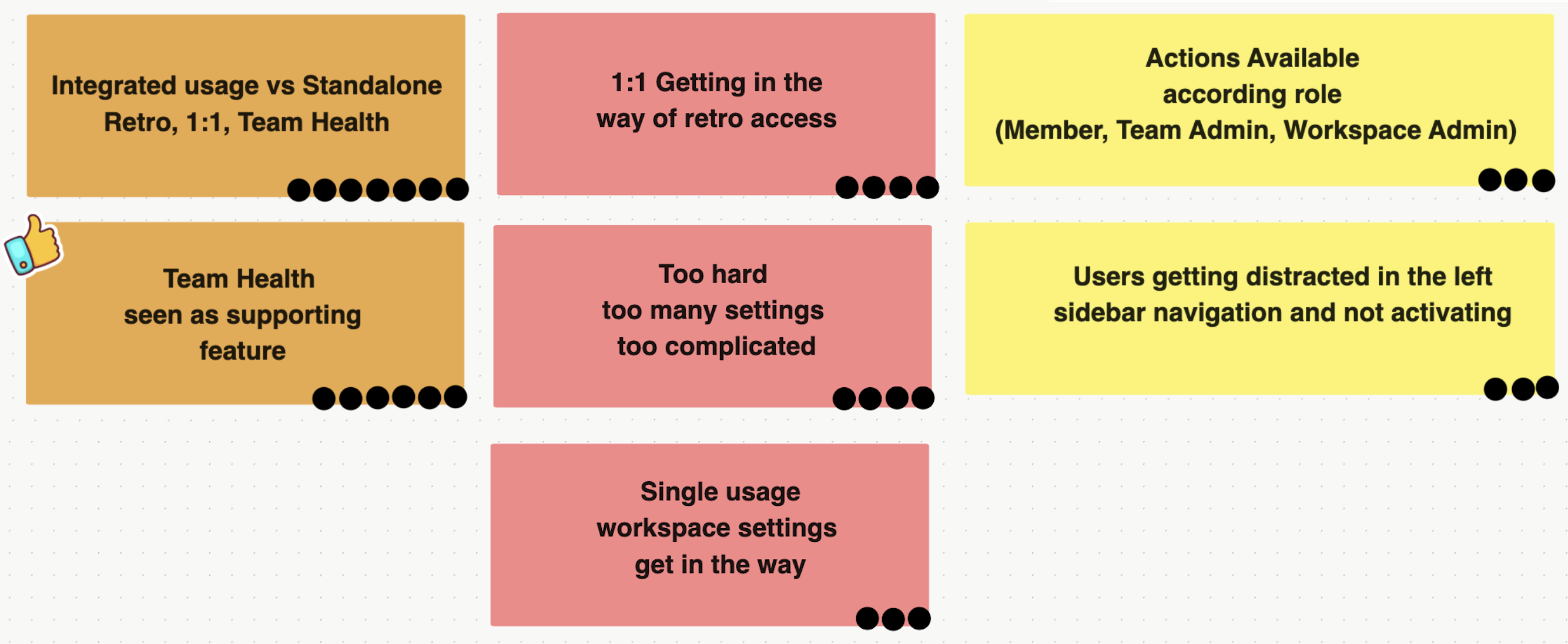
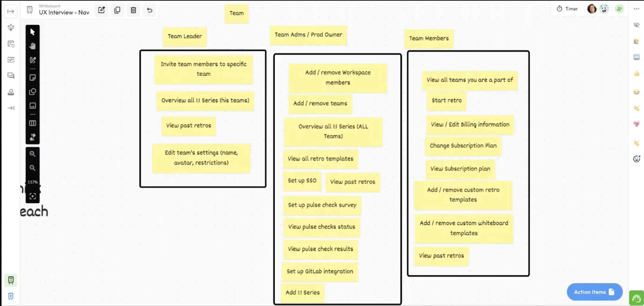
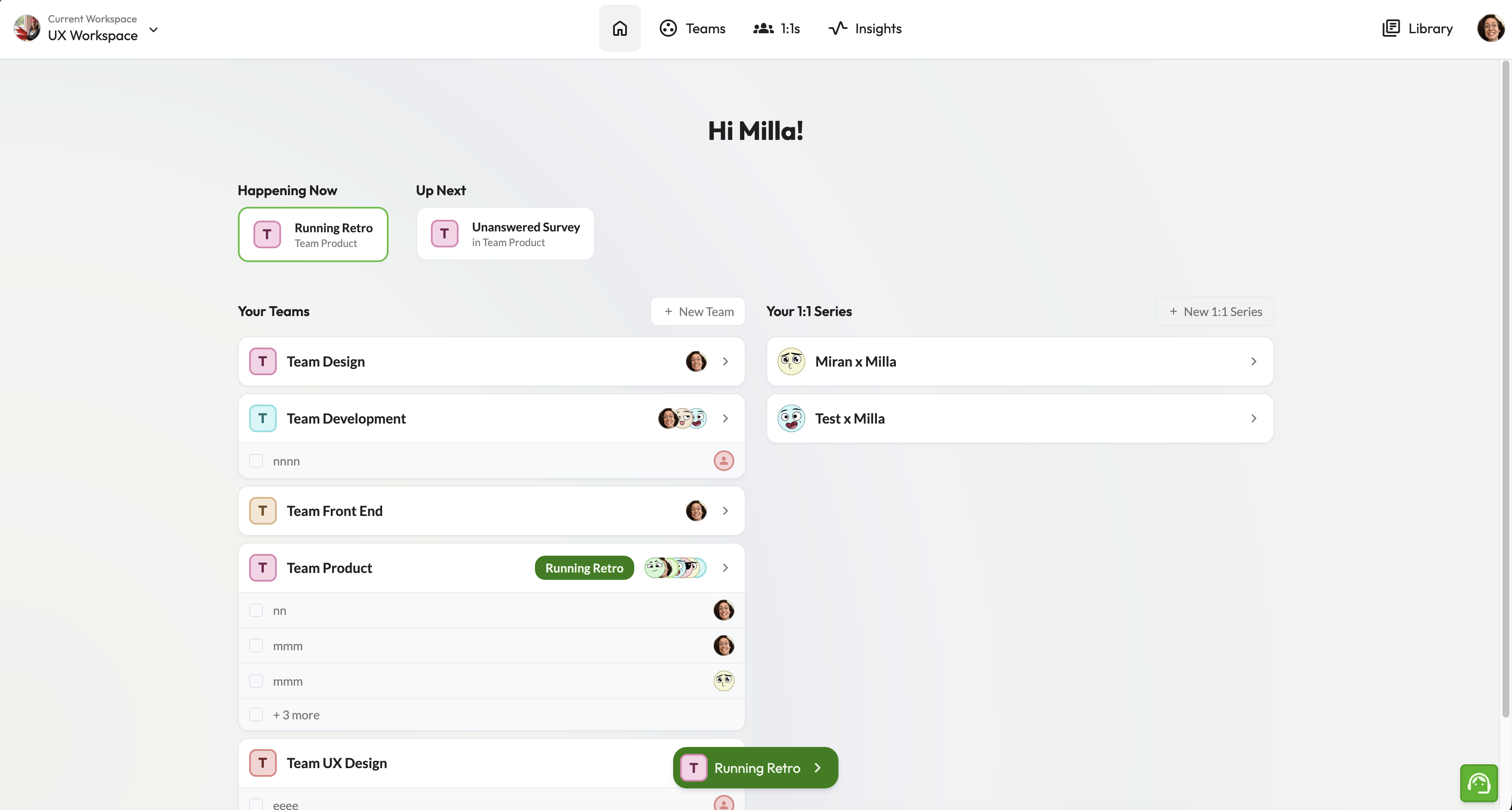
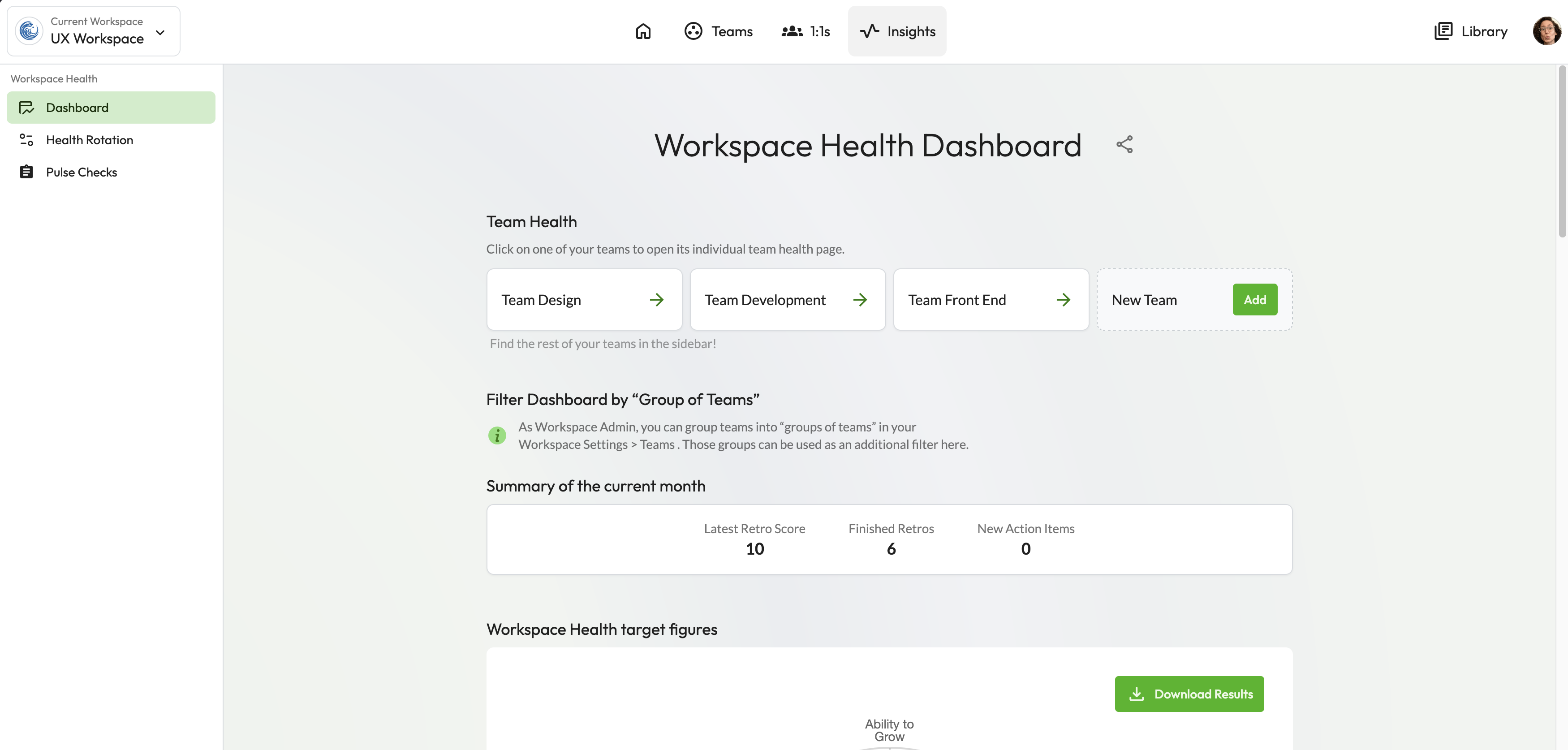
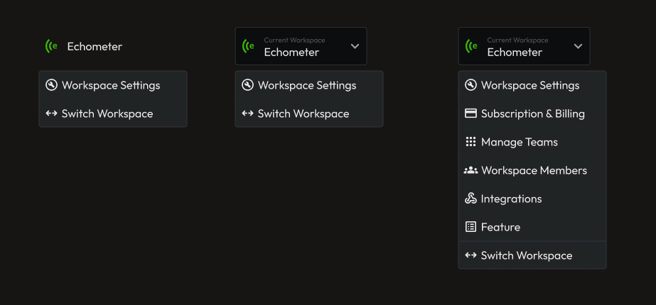
Three clusters of confusion surfaced. Users mixed Retros, 1:1s, and Team Health into one continuous workflow — they saw integrated usage, not standalone tools, and Team Health especially read as a supporting feature rather than a peer. As the product expanded, the IA had drifted into reflecting how the team had built it rather than how users used it — and the IA itself was teaching users the wrong mental model. Friction came from settings overload — too many controls and gates. The workspace configuration, template library, and account settings were all making access to retros harder and confusing. Role-based action availability was also not clear for users (Member, Team Admin, Workspace Admin). The lack of role transparency added a hidden axis of complexity that only surfaced during interviews. Navigation was reinforcing a mental model that didn't match how the product was actually used.

Information Architecture Navigation
Affinity diagram from 10+ user shadowings — dot count reflects how often each issue appeared
Workshop
"Users weren't just confused about where things were — they were confused about what the product was."

Discovery from user workshops

From feature-centric to entity-centric.

I ran structured workshops with the engineering and product team to pressure-test the proposed IA. Senior leadership was initially skeptical — changing the IA was a bigger change than we initially planned. Interview data shifted the decision, and the team agreed on a new IA via joint workshops.

Navigation structure options were explored using AI-assisted design generation, allowing rapid iteration across structural alternatives before committing to a direction.

Sub Navigation

Surfacing hidden products changed how users understood the platform

This project was not just about a navigation problem — it was a business opportunity. Surfacing the team health feature at the top level was a deliberate bet: if users discovered it, we believed it would drive feature adoption and increase payment conversion.

Echometer team health product had always taken a secondary level of priority compared to retros and 1:1s. This was fixed by taking the Workspace and Team Health Dashboard to the top level and presenting it on equal degree of importance.

Before
Old Navigation

Retros · 1:1s · Settings all at the same level. No clear hierarchy. Users had to learn the product's internal logic to navigate it.

After
New Navigation

Teams (containing Retros + Surveys) and 1:1s as top-level anchors. Workspace settings deprioritized. Navigation mirrors users' mental model.

Navigation rollout

Existing users vs. new users.

When rollout began, a small group of existing users pushed back. But the data supported the new structure for the majority — especially for PLG acquisition.

Rather than compromise the IA, I designed a transition path: existing users could optionally use the old layout during a migration window.

Navigation rollout
Constrains
Compromise on feature visibility and prioritization of next steps

The workspace settings were found to be harder to find on the new design, given extra clicks needed to reach it. Compromise had to be made favoring constant usage over first setup features. The second iteration surfaced workspace settings contextually, giving it a more button-like visual to make the settings easier to find.

Accessibility Concern

Every color decision in the navigation — text, icons, active and hover states — was validated against WCAG AAA (7:1 contrast ratio). The dark background treatment was reviewed as a separate pass, since contrast relationships behave differently at low luminance. AA compliance was treated as a floor, not a target. Keyboard navigation was verified to guarantee an accessible experience.

Navigation rollout

Validation & Rollout Strategy

Hypothesis: restructuring navigation around entities — Teams (Retros), 1:1s, Health — will increase M1 (activation: first retro achieved) by reducing distraction.

20
Non-user interviews

Participants with no prior Echometer experience were given structured tasks using the new navigation. Without an existing mental model, users correctly differentiated between Retros, 1:1s, and Health Checks — validating the entity-centric structure before rollout.

7 / 10
Existing users opted in

Task-based post-rollout interviews with existing users. 7 out of 10 completed tasks faster and with less friction in the new navigation. The 3 who didn't opted out not because of the design — they didn't want a different experience from their workspace until the full migration was available.

370
Users in live A/B

191 variant, 179 control. Primary activation metric (M1) not yet significant — experiment still collecting data. One month running, mid-experiment readout at day 32 of 60.

A/B Test
● Live · 1 month
+71.14%
Workspace Health visits — 96.0% confidence

Strongest signal so far. Users with the new navigation discovered and explored the Health module significantly more — directly validating the hypothesis that surfacing it as a top-level entity would drive feature adoption.

+23.71%
1:1s area visits — 89.0% confidence

Entity-centric structure is surfacing the right areas. Users are navigating with more intent across the product.

+21.28%
Activation (M1) · 80.6% confidence

Direction is positive and strengthening. Not yet statistically significant. Final readout at day 28.

Directing implementation, leaving reusable artifacts.

Design reviews

I led dedicated design review sessions to align the implementation with the intended interaction model and quality bar — ensuring the structural decisions survived the handoff intact. UI Review and Mico interaction reviews over multiple iteration rounds

Interview template

Post-implementation, I created a structured interview template to evaluate navigation changes — now used as a reference for future rollouts across the product.

Next Case Study

Retrospective Prep Flow